Butter Bakery
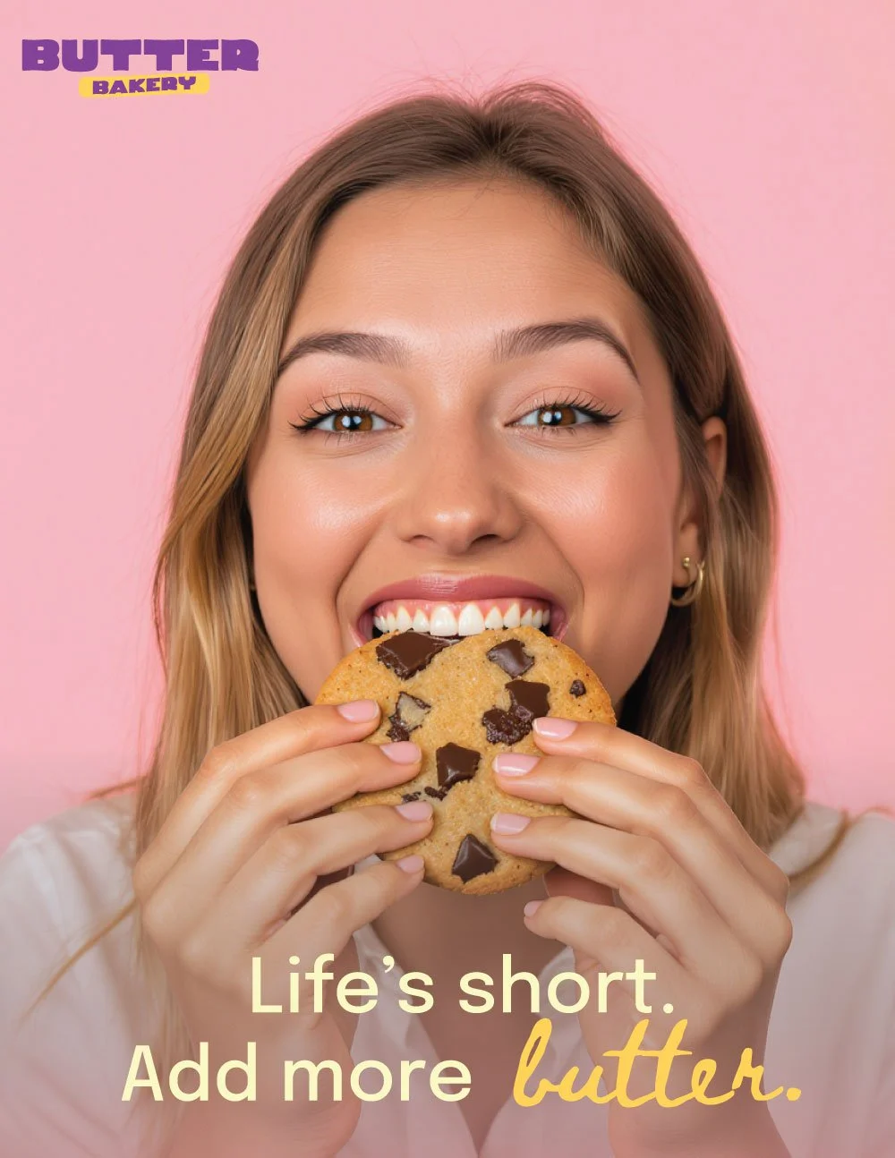
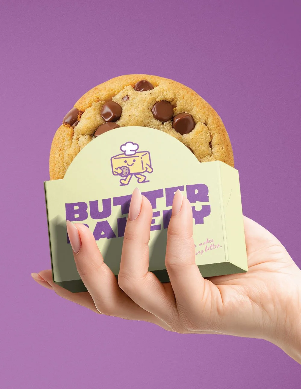
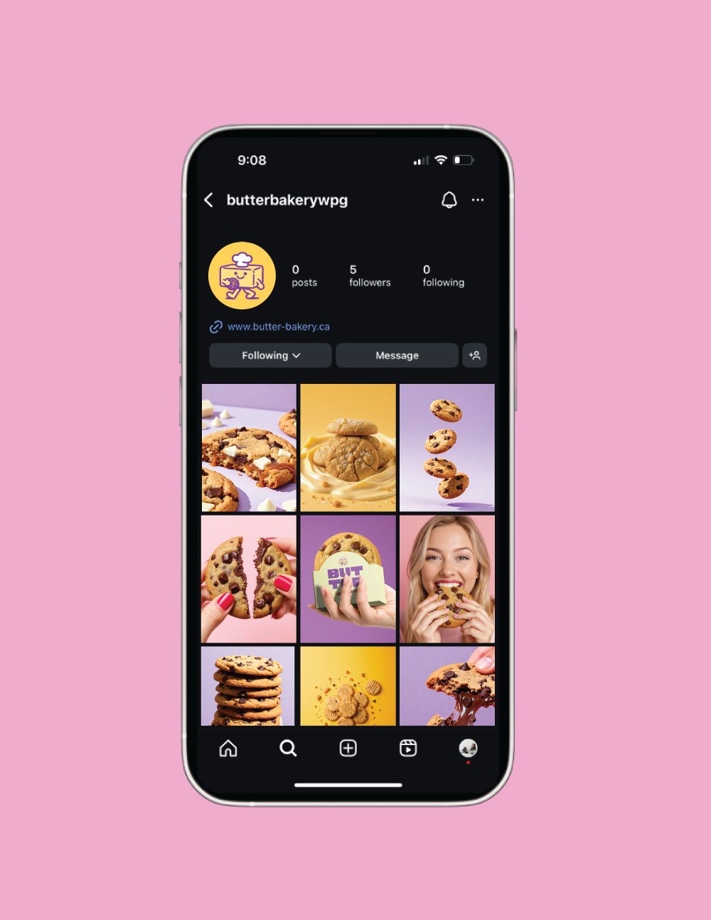
Butter Bakery’s branding was built to feel fun, bold, and instantly crave-worthy. The goal was to create a playful but polished system that stands out while still working seamlessly across packaging, social, and digital spaces.
A mix of rich purples, buttery yellows, and soft pinks brings warmth and personality to the brand, while a flexible logo system and custom icons keep everything cohesive and easy to use. Bold, legible typography ties it all together, resulting in a brand that feels approachable, memorable, and full of flavour.