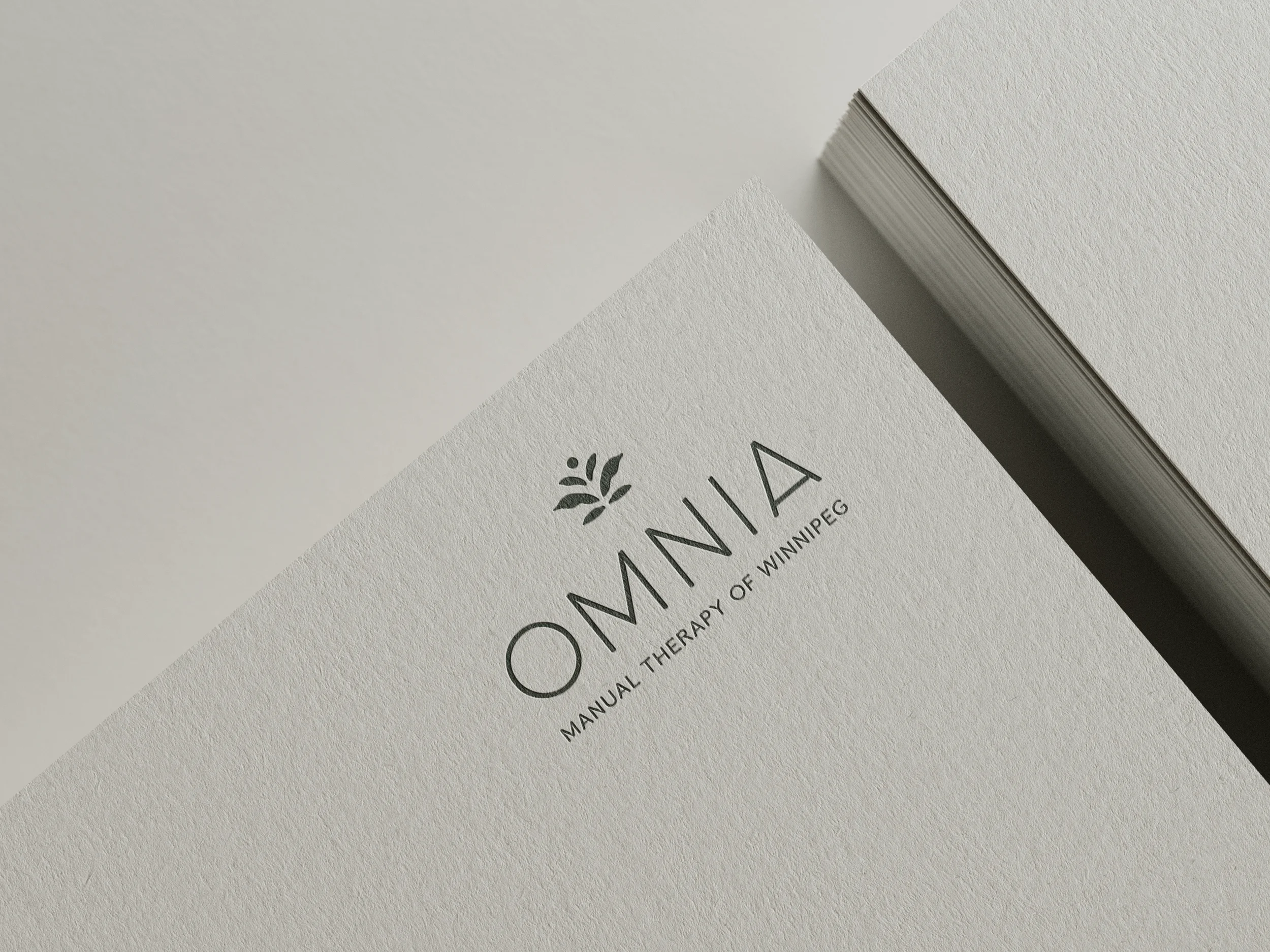
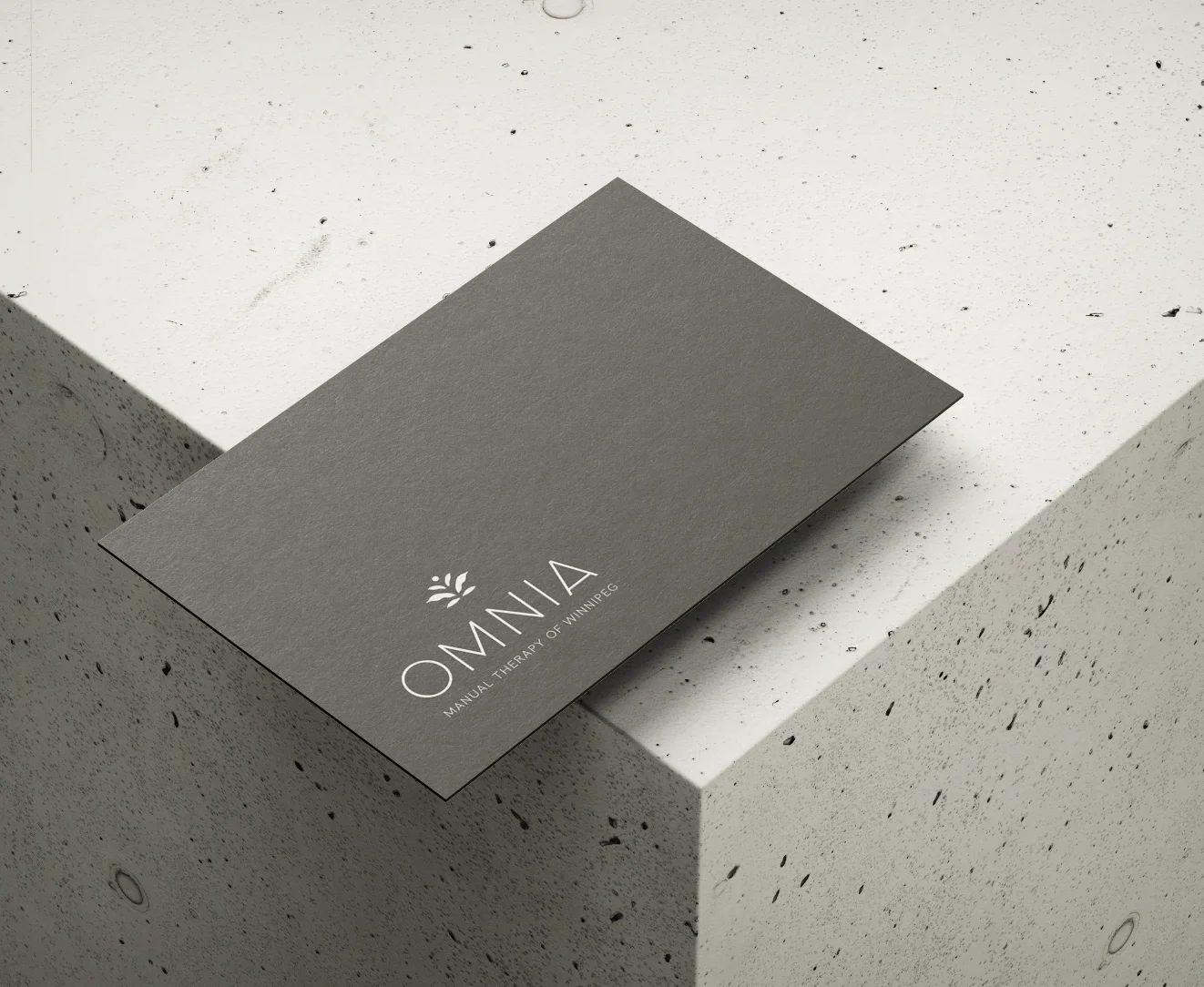
Omnia
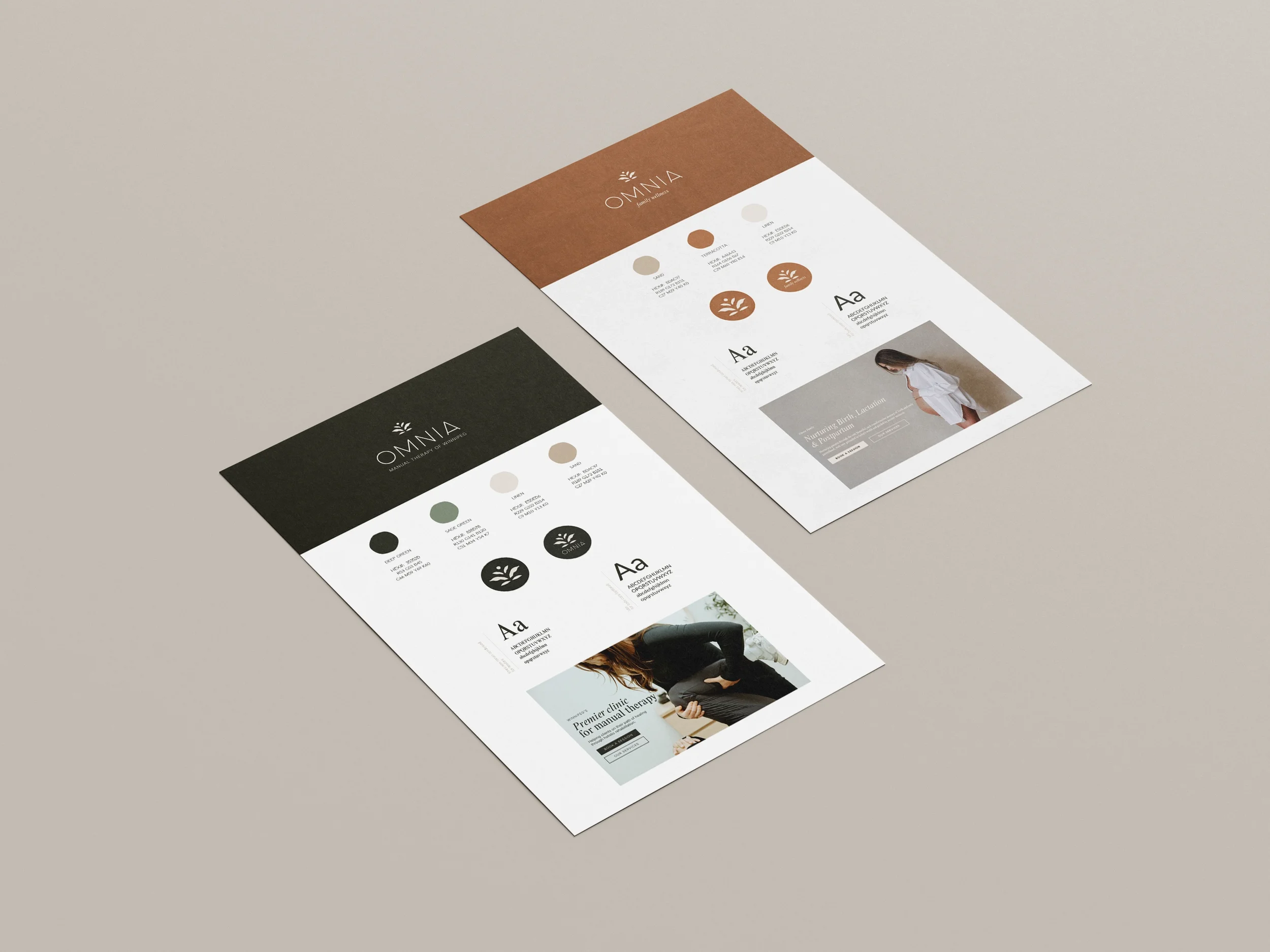
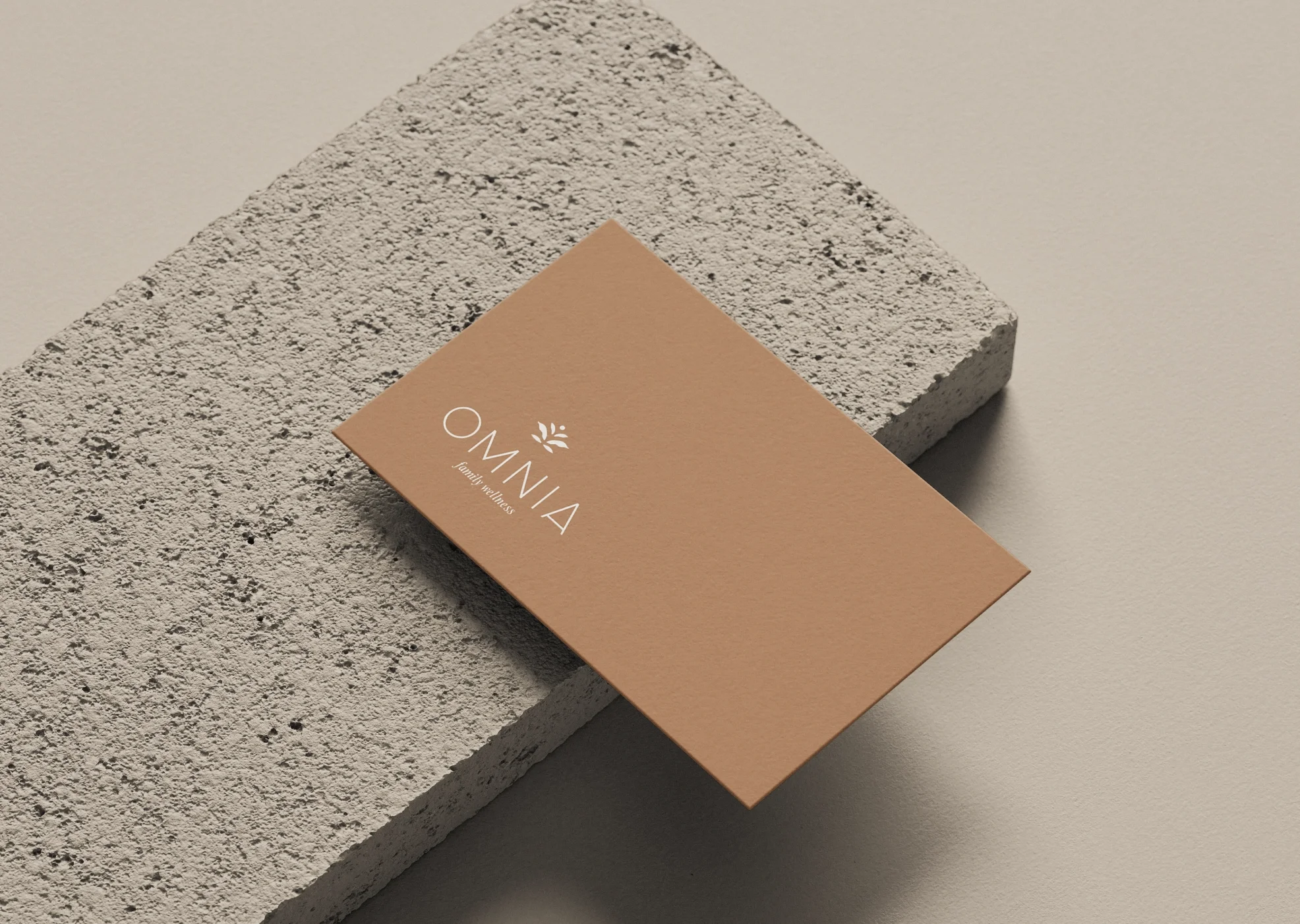
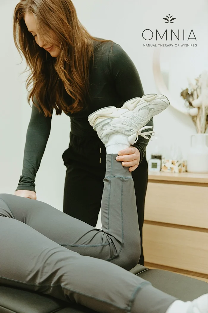
Omnia’s brand identity was designed to support two sides of the business, Omnia Manual Therapy and Omnia Family Wellness, while still feeling cohesive and connected. The goal was to create a visual system that feels calm, intentional, and welcoming across both offerings.
The branding was developed alongside the design of their new location, with the interior space and overall atmosphere guiding many of the visual decisions. Clean typography, a thoughtful colour palette, and simple graphic elements work together to create a brand that feels balanced, refined, and easy to navigate.
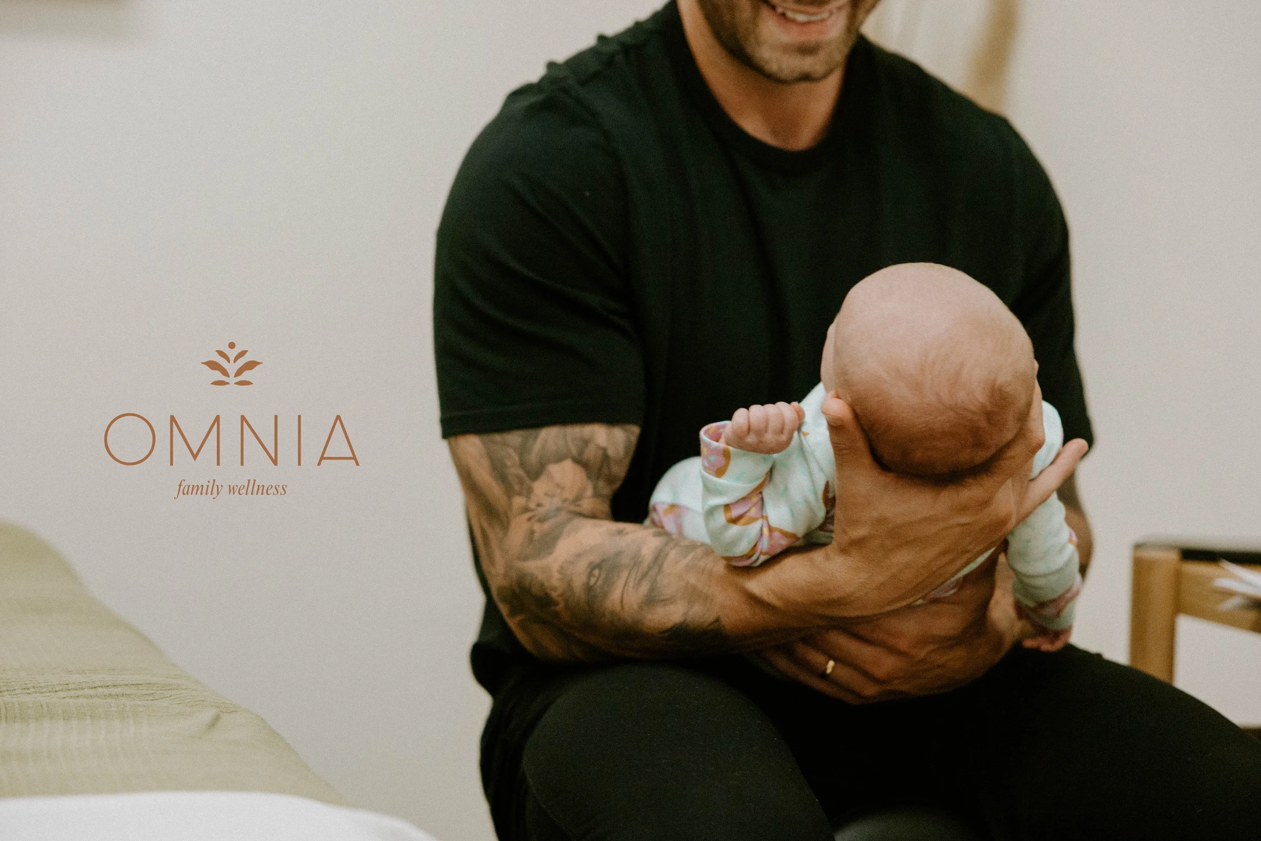
The result is a unified brand identity that supports both the clinical and family-focused sides of Omnia, while creating a warm, grounded experience that translates seamlessly from the physical space to digital and print touchpoints.
Creative Direction Collaboration with On The Move Studios.
Photography by: Courtney Champagne Photography